Atomic Design: A Front-end Developer’s View
Jan 30, 2019
5 mins

Full-stack developer @ FABERNOVEL
Having been a full-stack developer since IE7 was still a thing, I have worked on many projects during which the ways of working have evolved, ranging from single big CSS files to React components styled with CSS modules. However, I have now started using a new methodology—Atomic Design, a really powerful way of saving time, thanks, in particular, to the simplification of communication it offers between designers and front-end developers. Here, I share some insights gleaned from my first-hand experience of staying ahead of the curve.
What is Atomic Design methodology?
In short, this methodology deconstructs a page as a set of layouts containing elements called organisms, molecules, and atoms. This may sound similar to the Bootstrap library, but it’s different. It’s like creating a Bootstrap that is specific to your project. For more information and a deeper look at the definition, I recommend reading Atomic Design by Brad Frost, the creator of the methodology.

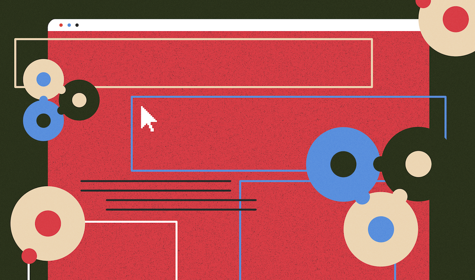
Illustration by Atomic Design
Why use Atomic Design?
When I first started using this methodology, it was for a large React-ts product with three single-page-app (SPA) projects. When I left the project, about a year later, the product was still growing and comprised three further SPA projects.
Some of these apps were developed by different teams simultaneously, numbering as many as 15 developers. This included a few experienced front-end developers, but some projects involved only junior front-end developers. Since React is also based on assembling small components, the teams had already started inputting common code without applying any formalism. Occasionally, we found visually identical elements but with two or more implementations. Therefore, something had to be done.
The concept of having a unique location with all the components you would ever need was really interesting and the prospect of seeing faster development times for new projects meant our customer readily agreed to move to Atomic Design (spoiler: it worked).
How we implemented it
This new methodology came to our attention at the same time as a redesign of our product was required. The first thing our designer did was produce various user-interface (UI) elements through all of the product’s apps. She then created the general templates used in the app, which was responsive to tablet in both portrait and landscape mode, as well as to desktop. All these elements were then assembled to have complete views.
On the developer side, we created the corresponding React elements. These included several atoms: icons and concepts such as colors and font sizes. The molecules included were small composed elements—buttons, tags, input elements, and overlays—while the organisms comprised bigger composed elements: an alert box, a side menu, a modal window or side panels. Some elements were more complex than others, and each developer was able to pick the ones most appropriate to their area of expertise.
Dedicating a specific amount of time to these elements allowed us to create more advanced elements without the stress of being late for an application feature. For instance, we had an organism displaying a list of tags on one line and “…” if there were too many tags for one line, depending of screen size (clicking on the “…” would then display the tags on the required number of lines). This kind of UI detail may go unaddressed if not developed early on in the project and may cause a delay with the first user story that requires it.
Our final task was to assemble all the components we created. First, we had a template for a login bar at the top that is present on all apps. Within this, we added another template with a sidebar (found at the top when used on tablets) that was needed for some apps. Finally, the content used other elements, ranging from organisms to atoms. We also repeated templates specific to an app that we grouped in app-specific molecules not shared with other apps, to avoid polluting the shared UI kit.
The UI elements created at the beginning of a project are not set in stone. They can evolve but should ideally remain backward compatible, otherwise subsequent projects may end up breaking previous ones. We used TypeScript and had continuous integration running on each pull request, which prevents some basic errors, although visual glitches or runtime errors are still possible.
The 4 lessons to be learnt from using this methodology
Naturally, there is always a lot to learn from a new methodology that will help your next projects run more smoothly.
1. Synchronize before starting
When I re-implement this method, I will definitely spend more time with designers defining the scope of some molecules. We also had some trouble finding the correct granularity for organisms. It is sometimes hard to see the boundary between what is generic to the product and what is specific. We ended up creating some very specific organisms that could only be used in one way. Knowing all your components also allows you to plan ahead the elements that should interact with particular animations and what should be visible in smartphone or tablet mode. Finding a good naming convention is also recommended.
2. Create all atoms/molecules/organisms first
At the start, I thought that it would be like creating the components when they appeared in the developed pages, but creating all the components before creating a page is different. You tend to create cleaner components, more generic, and with all possible states in mind. With a design system, one of the key benefits is that more experienced front-end developers can focus on more complicated components, while the juniors, or back-end developers, who have ended up having to do front-end development, can focus on simpler elements. Once everything is created, it is also easier to estimate user stories and have a consistent velocity, meaning there is no more hidden lost time spent creating new components. Last but not least, developers not at ease with CSS were pleased to use the components given to them to work on.
3. Documentation is key
We slightly failed with this, because we only started creating documentation halfway through creating the components. This meant that someone (i.e., me) had to go through all the components retroactively to add documentation, which seemed like lost time to our customer. If you want a documented atomic design system, do it from the beginning! And, above all, use meaningful names that are simple enough for anyone working with it to understand.
4. With great power comes great responsibility
The biggest challenge for new developers on the project was getting used to our components, which was easy. However, be aware of a side effect we saw later on during the project: having a shared codebase for components is nice, but it may also be dangerous if inexperienced developers start to modify it. Our app was broken a few times by developers from other apps who carried out modifications they shouldn’t have.
All this planning ahead and documentation adds to the cost of a project, and this methodology may not be relevant to small products. However, it is essential for products with several apps that require a common design line. For smaller projects, this method only helps with how UI elements are organized: atoms, molecules, organisms, and templates. It is the first thing I put into action when I joined the team of my current project. Nobody complained.
This article is part of Behind the Code, the media for developers, by developers. Discover more articles and videos by visiting Behind the Code!
Want to contribute? Get published!
Follow us on Twitter to stay tuned!
Illustration by Blok
More inspiration: Coder stories
We can learn a lot by listening to the tales of those that have already paved a path and by meeting people who are willing to share their thoughts and knowledge about programming and technologies.

Keeping up with Swift's latest evolutions
Daniel Steinberg was our guest for an Ask Me Anything session (AMA) dedicated to the evolutions of the Swift language since Swift 5 was released.

"We like to think of Opstrace as open-source distribution for observability"
Discover the main insights gained from an AMA session with Sébastien Pahl about Opstrace, an open-source distribution for observability.

The One Who Co-created Siri
Co-creator of the voice assistant Siri, Luc Julia discusses how the back end for Siri was built at Apple, and shares his vision of the future of AI.
The Breaking Up of the Global Internet
Only 50 years since its birth, the Internet is undergoing some radical changes.

On the Importance of Understanding Memory Handling
One concept that can leave developers really scratching their heads is memory, and how programming languages interact with it.
The newsletter that does the job
Want to keep up with the latest articles? Twice a week you can receive stories, jobs, and tips in your inbox.

Looking for your next job?
Over 200,000 people have found a job with Welcome to the Jungle.
Explore jobs