Why Data Visualization is Essential in Every Step of Machine Learning
31. 10. 2019
5 min.

Content writer with a background in programming and statistics.
Before the hype of machine learning, artificial intelligence, and big data analysis, there was statistics. Statistics is the study of patterns using mathematics. Math is the foundation of algorithms. Statistics is one way to apply math to understand problems in the real world. In statistics, exploratory data analysis is one of the first ways to zoom in on the data that matters. In a sense, exploratory data analysis is a way to cut out the noise. It’s also a way to forge a path into the forest of data that your algorithm will comb through. Data visualization has become popular in recent years due to its power to display the results at the end of the machine learning process, but it is also increasingly being used as a tool for exploratory data analysis before applying machine learning models.
At the beginning of the machine learning process, data visualization is a powerful tool.
Machine learning is inherently an iterative process. Modeling can be cumbersome when you are performing the process over and over again to ensure your model is optimized and can generalize well. Add on the time you spend on model selection and model tuning, the process can easily become a frustrating one. Good exploratory data analysis combined with relevant data visualization is essential for pinpointing the right direction to take. It both shortens the machine learning process and provides more accuracy for its outcome. Data visualization tools such as TensorFlow enable data scientists to quickly identify and focus on the most important data and the most important paths to take. Even during the modeling process, model graphs can help to speed up the model-creation process by displaying the model maps conceptually. When evaluating the models, visualizing the results of hyperparameter tuning can help data scientists narrow down the groupings of hyperparameters that are most important.
The modern machine learning process
The machine learning process consists of the following:
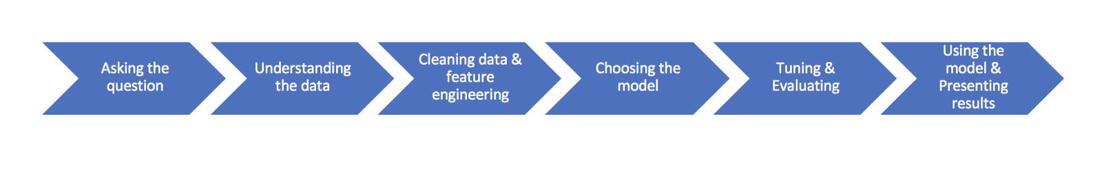
In this process, exploratory data analysis is found in steps 1,2, and 3. At each of these steps, data visualization helps the data scientist explore the data, understand the data and process the data to set it up for modeling.
Ask the right question by putting the data into context first
Since the machine learning process is iterative, asking relevant questions to kick off the process will involve putting data into context. As you progress in your machine learning process, you can refine your questions to zoom in on the most important details. Putting data into context means that you will visualize all the columns within the data to understand the following:
- The meaning of each column of data.
- Whether it’s a categorical or continuous variable for each column.
- Whether the data is an independent or dependent variable.
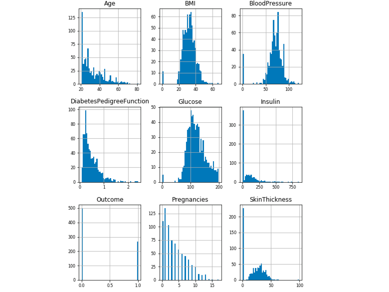
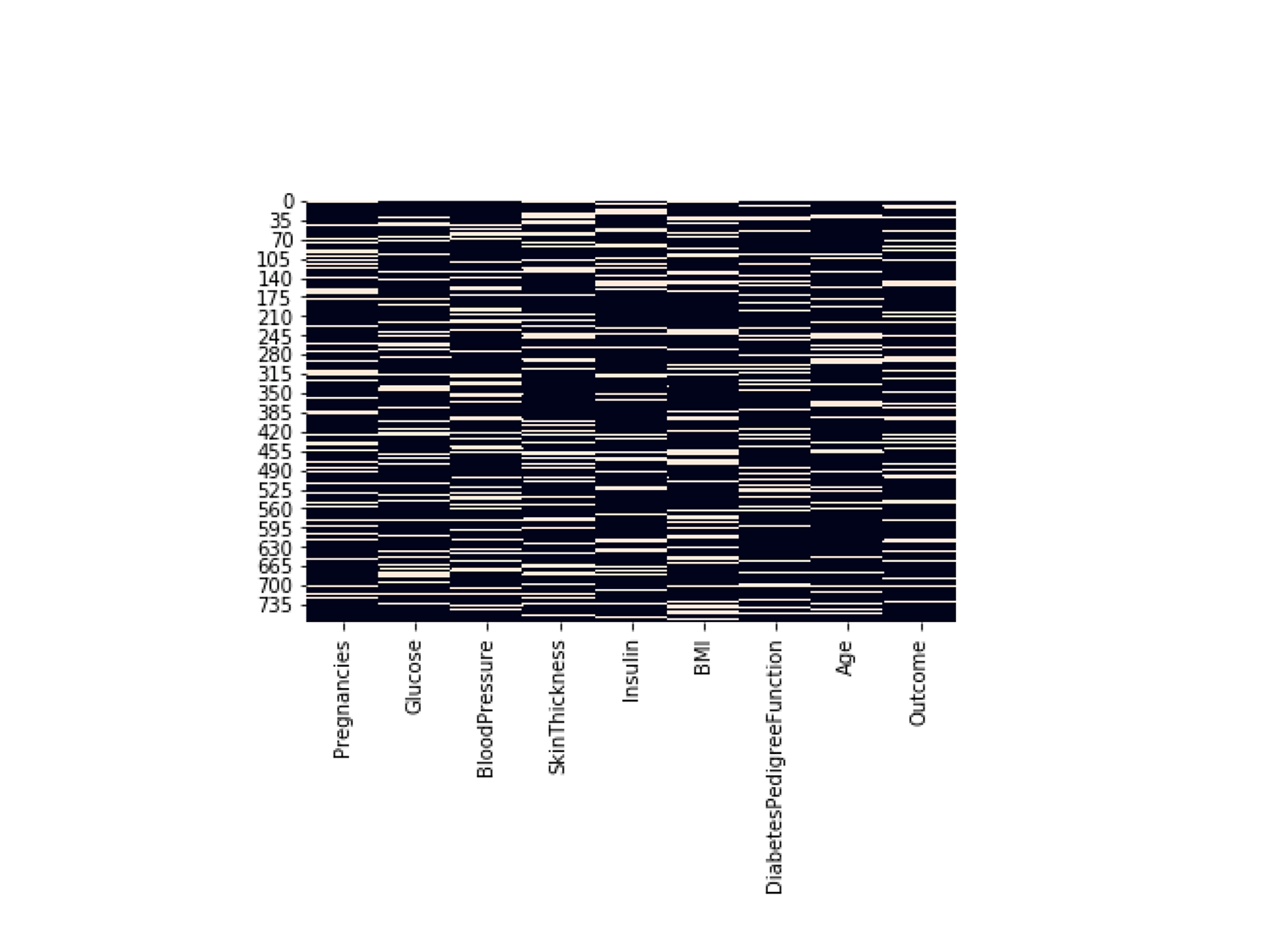
Using the Pima Indian Diabetes Dataset, below is an example of visualizing every column to determine the ones that have categorical variables rather than continuous variables.
How does each column of data relate to the question you are asking?
Below is an example of a boxplot showing Outcome as a categorical variable. The categories are: 0 (no diabetes), 1 (have diabetes). The question here is how is Age distributed in different categories of Outcome?
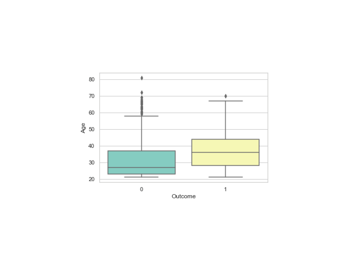
If you change the meaning of the variable Outcome by flipping the two categories—0 (have diabetes), 1 (no diabetes)—then the results of your analysis will be very different.
Similarly, if Age were measured in categories—young, middle age, old—then the question you will ask the data will be: How do the categories of Age correlate with the categories of Outcome?
When you put data into the context of the problem both conceptually and technically, then you can proceed to ask the relevant questions of the data.
Understand the data by understanding both sides: good and bad
The next step in the machine learning process is understanding the data. There are many aspects to this. Ultimately, the iterative nature of the process will allow for a continual understanding of the data as you move through more iterations of modeling. But, to begin with, understanding the data involves asking the following:
- Where are the possible data errors, such as missing data, wrong data types, misleading data, and outlier data, and so on?
Below is an example of a nullity matrix that gives you missing data information visually on columns of data.
By viewing the density of missing data in various columns, a decision can be made at the data cleaning step to use a particular missing data imputation technique for a given column. Visualization tools such as Python’s seaborn.heatmap and R’s heatmap() functions help to gauge the degree of missing data in each column.
- Where are the imbalances of data?
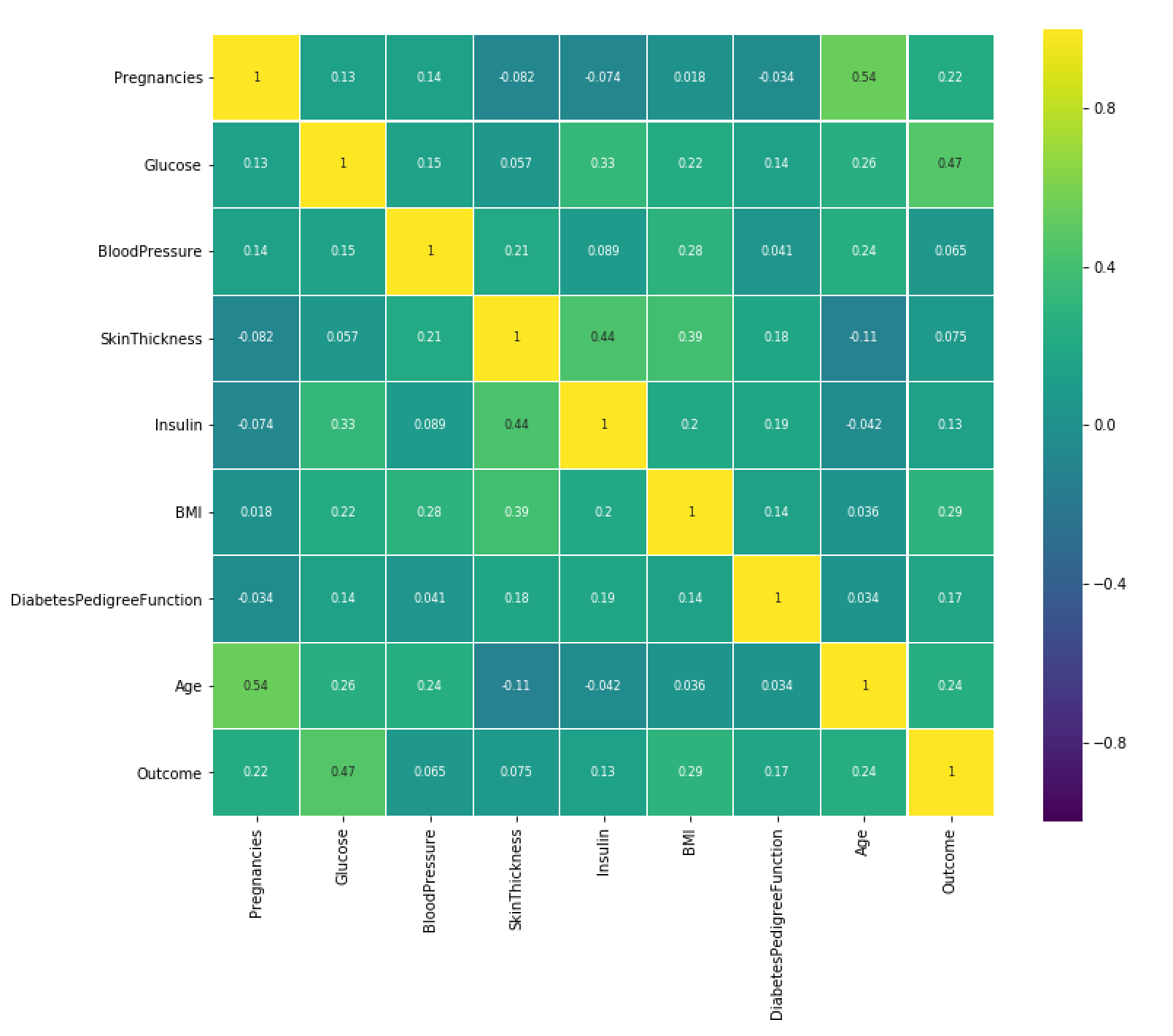
Below is an example of using a heatmap to represent the correlation of the relationships between the variables.
High-density areas can be identified and groups of variables that are highly correlated, such as multicollinearity, can be further investigated. In certain algorithms, such as Decision Tree algorithms, multicollinearity can lead to overfitting.
- What are the relationships between the variables? How strong are these relationships (density)?
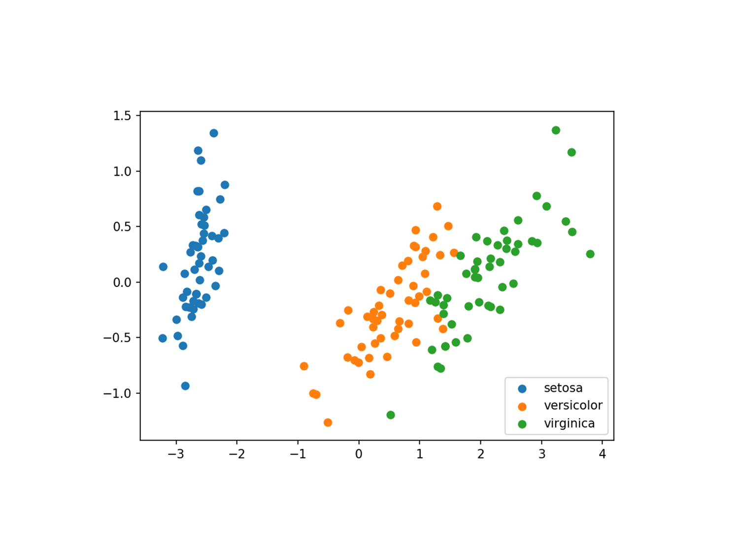
Below is an example of using Principal Component Analysis to visualize the correlation groups of the variables in the Iris dataset.
This initial visualization can tell you if there are overlaps in groups and if new features need to be defined to better fit the data. Based on the correlations, a narrower set of features may be selected during feature engineering. Some of the features may need to be decorrelated to fix issues such as multicollinearity.
Data visualization can power model creation and model tuning
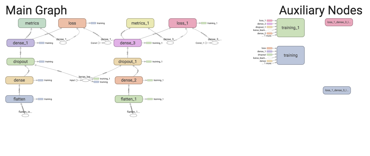
With the advancement of data visualization techniques, model creation and model tuning do not have to be abstract processes. TensorFlow allows you to follow the model-creation process with data visualization at each step, and when building a TensorFlow model, you can visualize the model’s structure and follow the data to see if the model fits your design.
Below is an example of the conceptual graph of a Keras model. The data flows from the bottom to the top. The graph is a representation of the definition of the model.
Tuning is an important part of modeling. Unlike parameters that derive their value from training, the values of hyperparameters are defined before the learning process begins. These hyperparameters control the behavior of the algorithms and have an impact on the performance of the model. Concerns of hyperparameters, such as trainability, tunability, and robustness, determine the usability of the models.
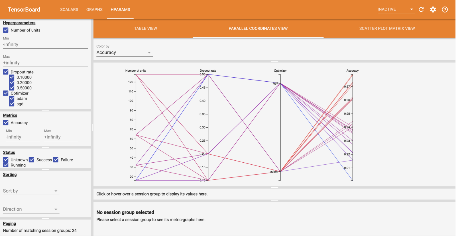
Below is an example of TensorBoard’s HParams that displays groups of hyperparameters to see which ones are the most important. You can define criteria such as accuracy and dropout rate to determine the performance.
Conclusion
Before popular data visualization tools for machine learning were developed, the machine learning process was much more abstract. Historically, ggplot2 in R provided much-needed visualization tools for exploratory data analysis. But today, with the suite of data visualizations that are available in Python, such as seaborn, scikit-learn, and matplotlib, exploratory data analysis that forms the initial part of the machine learning process can be done much more efficiently. At the same time, with TensorFlow, model-building and model-tuning processes become a lot more intuitive. Rather than spending time on scrutinizing values, with the assistance of both 2-dimensional and interactive data visualizations, data scientists can pay more attention to the big picture of the data at each level of the machine learning process to focus more on the meaning of the data, the model design, and the model performance.
This article is part of Behind the Code, the media for developers, by developers. Discover more articles and videos by visiting Behind the Code!
Want to contribute? Get published!
Follow us on Twitter to stay tuned!
Illustration by Blok
Další inspirace: Coder stories
We can learn a lot by listening to the tales of those that have already paved a path and by meeting people who are willing to share their thoughts and knowledge about programming and technologies.

Keeping up with Swift's latest evolutions
Daniel Steinberg was our guest for an Ask Me Anything session (AMA) dedicated to the evolutions of the Swift language since Swift 5 was released.

"We like to think of Opstrace as open-source distribution for observability"
Discover the main insights gained from an AMA session with Sébastien Pahl about Opstrace, an open-source distribution for observability.

The One Who Co-created Siri
Co-creator of the voice assistant Siri, Luc Julia discusses how the back end for Siri was built at Apple, and shares his vision of the future of AI.

The Breaking Up of the Global Internet
Only 50 years since its birth, the Internet is undergoing some radical changes.

On the Importance of Understanding Memory Handling
One concept that can leave developers really scratching their heads is memory, and how programming languages interact with it.
Zpravodaj, který stojí za to
Chcete držet krok s nejnovějšími články? Dvakrát týdně můžete do své poštovní schránky dostávat zajímavé příběhy, nabídky na práce a další tipy.

Hledáte svou další pracovní příležitost?
Více než 200 000 kandidátů našlo práci s Welcome to the Jungle
Prozkoumat pracovní místa