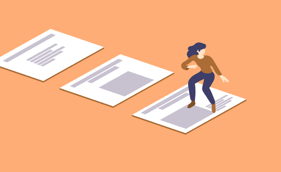
How to Take Your Talk Slides to the Next Level
03 sept 2019
7 min

Tech public speaking coach
Slide decks are an important part of any technical talk. Great slides should act as a support to your message: They should help your audience understand your point without distracting them from what you’re saying. Finding the right balance can be hard at first, so here are some tips to help you create a clear and impactful deck.
Why you need slides
As the saying goes, “A picture is worth a thousand words.” If you talk about code, you need to show code. If you talk about UI, you need to show screenshots. No matter how detailed your spoken explanation is, your audience will read and understand a piece of visual information much faster than you could ever explain it. Show, don’t tell.
Slides help people follow your point
Great slides will allow your audience to follow you at their own pace. If you’re talking about cloud infrastructure, dependency graphs, caching mechanisms, or any topic that involves complex moving pieces, you should do your audience a favor and show them a schema. They will process the information both from what they hear you saying and what they see on screen.
Having two channels for conveying information makes it even easier for people to keep up if they get distracted during the talk. Let’s be honest, we all lose focus in the middle of talks because of email alerts, or because our minds start wandering due to something the speaker has said. You can’t expect people to be 100% focused on what you’re saying 100% of the time. Your slides will help them catch up on what they missed.
Slides are helpful for beginners and pros alike
Slides are particularly important if you’re new to speaking. Without meaningful slides, your audience will only be guided by your voice, which means your speaking skills will need to be stellar to keep them hooked. With well-crafted slides, you will be able to offload part of that burden onto what’s being displayed on the screen.
But even if you’re an experienced speaker, don’t dismiss how much attention you need to pay to your slides. People don’t attend a tech conference like they would go to a one-person show: They don’t come to see you on stage, they come for your content—for what you’re going to share and what they will learn from it. Slides are part of your content and should be treated as such.
Slides keep living even when your talk is over
The usefulness of slides doesn’t stop at the end of your talk either. They have a second, longer life after the talk. Your audience will look at them again to jog their memory and they’ll follow links to tools you mentioned. Great slides will also be of help to people who weren’t able to attend your talk: If the slides are clear enough, they’ll be able to get the gist of what your talk was about and be able to follow your main points.
For this to happen, you will need to share a link to your deck on social media, which conference organizers will relay. Also, to maximize your reach, it’s best to use a file format that anyone can read, such as PDF or HTML (avoid proprietary formats used by apps such as Keynote and PowerPoint). You could even share your slides before your talk—this will help people with hearing or sight impairment to read them with their own devices at their own pace.
You don’t need to use PowerPoint
Nor Keynote. Nor any specific tool, actually.
There are better, developer-centric, alternatives
For us developers, the prospect of having to use a proprietary tool such as PowerPoint and its point-and-click interface can be daunting and we would usually do anything to avoid it. We’re used to writing code that does what we want to express, not having to click our way through menus and submenus to align text.
But it doesn’t have to be this way. You don’t need to use PowerPoint—it’s just one of a wide range of tools that you can use, and there are lots of other alternatives that are much more suited to a developer’s mind-set. Reveal.js is a great example that allows you to create a slide deck in exactly the same way you would create a website—by writing HTML, CSS, and JavaScript. Because it’s all just code, you can even push it on GitHub and host it on Netlify, just as with any other web project.
Pick the tool you’re most comfortable with
Being able to create slides with the tool you’re most comfortable with is key. Reveal.js was one of the first of its kind to be created, but others soon followed. Slides.com is an online version of reveal.js. If you’re more of a React developer, you could have a look at MDX Deck. For even more geeky alternatives you can create slides directly from your terminal or from Vim.
Google Slides is also pretty good: It has the right balance of features/flexibility to get you started. You won’t do as much as you could with your own custom CSS/JavaScript in reveal.js, but it does have all the basic blocks needed to create great slides.
The main takeaway here is that you don’t have to use PowerPoint or Keynote to create slides. Pick the tool you’re most comfortable using and the one that will help you produce your first slides the fastest.
Start with the three most important slides—the first, second and last ones
When creating your deck, you should focus on these three first and then develop your story between those boundaries.
Write your talk title on your first slide
This is the slide your audience will see before you even start talking. It will be displayed on the screen while people are taking their seats and technicians are double-checking the video and audio settings. By displaying your talk title, you will help the audience to find the right room. And this slide also makes a great thumbnail when sharing your deck on social media.
Introduce yourself on the second slide
Use this slide to say hi, who you are, and why you’re here. The audience will appreciate that you took the time to introduce yourself before diving into your talk.
Say your name aloud—make it clear how to address you. If you know people get confused by your name (such as by how to pronounce it, which one is your first and last name, what pronoun to use), this is the time to remove any ambiguity. By doing so, you’ll make people more comfortable about coming to talk to you during the break, and confident that they won’t make a faux pas by getting your name wrong.
State what your job position is and how it’s relevant to the talk. You don’t need to be an expert to talk about a specific subject, but if you are, say so. “Hello, I’m a front-end engineer and I’m going to talk about CSS,” is as valid an introduction as “Hello, I’m a devops engineer and I’m going to talk about CSS.” Stating your angle at the beginning of the talk will allow the audience to set their own expectations.
Write all the relevant links and contact information on the last slide
The last slide will be the most-shared one on social media. Why? Because it will be displayed on the screen behind you throughout the Q&A session, which is when people will have more time to take pictures. You will want it to display all the relevant email links, Twitter account, GitHub repository, and even that ubiquitous “By the way, we’re hiring” banner.
The last slide is also a clear marker that your talk is over. When they see it, the audience will know that they can clap as soon as you’ve finished talking and help you to avoid those embarrassing moments of nobody clapping when you’ve got to the end of your talk or when people start clapping when you haven’t actually finished… Having this clear “Thank you!” final slide should prevent any such awkwardness.
Ways to make your slides clearer and more engaging
As with any discipline, making slides has its share of best practices that could help you make the right decisions when in doubt. Remember that slides should help people understand your point by making it clearer and more explicit. Here are a few ways to ensure that happens.
Make sure your text is legible
This means increasing the font size enough so that people at the back of the room can read it. Make sure your contrast between the background and text color is strong enough. If in doubt, light background and dark text works best, even with poor projectors and room conditions. If you know you’ll be in a dark room, though, use a dark background with light text.
Keep it to one idea per slide
Walls of text are not fun, and the moment the audience starts reading text set out like this, they’ll stop listening to you. Instead, split the content into two or more slides. Smaller, bite-sized chunks will help your audience to grasp your message faster, and as a bonus, doing this will also make reorganizing your deck easier.
Don’t distract the audience
Avoid animated GIF and complex animations. Everyone loves a funny cat GIF, but if you put one in your slides, people will tune you out while waiting for the GIF to loop and not catch anything you’re saying. Your slides should never distract the audience from what you’re saying.
For complex, multi-step processes, such as a navigation of a UI journey or data-replication architecture, you might be tempted to use an animation to show all the steps and how they fit together. Don’t. Go for still screenshots and schemas instead—as above, using animations forces the audience to follow the animation speed or wait for a full loop before being able to catch up with what you’re saying. By using still screenshots and schemas, they will be able to follow at their own pace, absorbing both what you’re saying and what they see.
Tools such as reveal.js or Keynote do make it easy to add animations to slides and text, such as having each slide as a different face of a 3D cube that you can turn around, or text falling like a heavy rock, shaking the whole screen. However, we advise keeping clear of gimmicky animations like this. They don’t add anything to your message and will probably end up distracting your audience, too. Animations in talks should follow the same rules as those used in UX: They should have a purpose and be subtle. A good rule of thumb is that no animation should take longer than 200ms.
Make every slide different
The best way to keep your audience engaged is to avoid monotony, so try to make every slide different from the one before. Try different layouts or background colors. Alternate between text and images and full-page quotes, etc. If the slides are too similar, people are likely to get distracted more easily, whereas if they’re all slightly different from each other, your audience will feel like they’re moving forward through the story you’re telling.
Time to get started
We’ve now seen how important a slide deck is to a tech talk, so it’s time to pick the tool you’re most comfortable using and start creating your first and last slides boundaries before filling in the middle slides with all your ideas. Keep in mind the main mantra—“Add to your spoken message, don’t distract from it”—and you’ll be well on your way to creating a great slide deck for your next talk.
This article is part of Behind the Code, the media for developers, by developers. Discover more articles and videos by visiting Behind the Code!
Want to contribute? Get published!
Follow us on Twitter to stay tuned!
Illustration by Brice Marchal
Más inspiración: Career hacking
Because being a developer is not just about coding, we want to share dedicated tips on soft skills and career paths, help you stay up-to-date with your favorite technologies, and learn more about the job market.

Computing’s Gender Divide: Why Tech Is Stuck in the 1980s
Discover why the percentage of women who held computing-based jobs has been in a steady decline since the 1980s.

5 Remote-work Lessons From the Open-source Community
The open-source movement has a few things it can share about remote working with the wider software-development community.
2019 Stacks Report
The most-mentioned technologies in the job specifications published on WTTJ's website in 2019 and the average number of applicants per technology.

Engineering Management: An Interview with Saad Rehmani
Saad Rehmani, the VP of Engineering at Reddit, shares his most effective management strategies to handle the COVID-19 crisis.

Engineering Management: An Interview with Rich Archbold
Rich Archbold, the VP of Engineering at Intercom, explains how to develop a management style and how to transition to managing other managers.

¿Estás buscando tu próxima oportunidad laboral?
Más de 200.000 candidatos han encontrado trabajo en Welcome to the Jungle
Explorar ofertas